.jpg?maxsidesize=500)
.jpg?maxsidesize=1920)

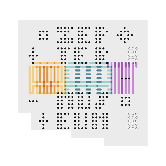
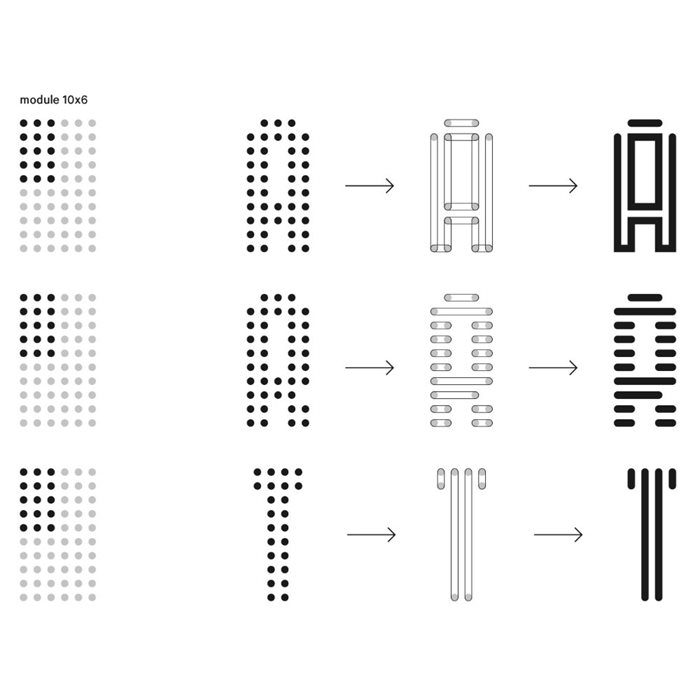
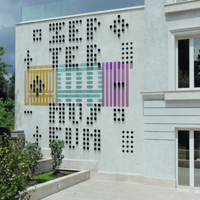
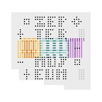
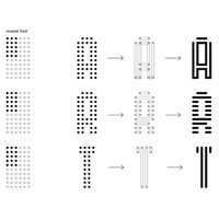
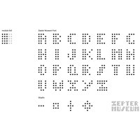
The concept of the visual solution was born from the peculiarities of the facade itself, in fact, taking inspiration from the circular windows a whole modular typeface was developed. For this purpose, the original 3x5 dotted base grid of the windows was expanded to a 5x5 and used to design, by subtracting points, the Zepter Museum font, named as an homage since these words are displayed in the final artwork. Contrast is the most important aspect of this project phase, since the legibility of the letters depends on it, for this reason the colors for the typeface and background are black and white, the highest existing contrast duo. To enhance the content of the museum a graphic mark was designed for the word ART using a different module obtained from the repetition 4 dotted base grids. As the letterforms were designed, a different interpretation was made for each, in order to achieve good results in terms of contrast and legibility. The letters, displayed in 3 different eye-catching colors, have been layered creating a transparency effect and adding dynamics and movement to the facade. Repetition, contrast, overlap, and high visual impact are the keywords of the project. Materials were chosen for their appearance characteristics and wheater resistance: high-quality exterior matt paint and ceramic tiles are durable and hold aging caused by external agents.